
What Makes Quartz Worktops Look Cheap?

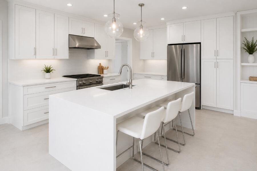
Quartz worktops are supposed to make kitchens feel modern, luxurious, and expensive-looking. But sometimes the final result does the complete opposite.
Instead of looking premium, the kitchen suddenly feels flat, artificial, or even slightly budget.
This is one of the biggest concerns homeowners have when planning a new kitchen renovation.
The truth is, quartz itself rarely looks cheap. In most cases, it is the combination of colour choices, lighting, edging, cabinet pairing, and installation details that affects the final appearance.
A lot of homeowners browsing stonedcollective often ask questions like:
- “Why does my quartz look fake?”
- “How do I make quartz look expensive?”
- “What colour quartz looks most luxurious?”
- “Can cheap quartz ruin a kitchen?”
The good news is that most of these mistakes are completely avoidable once you know what to look for.
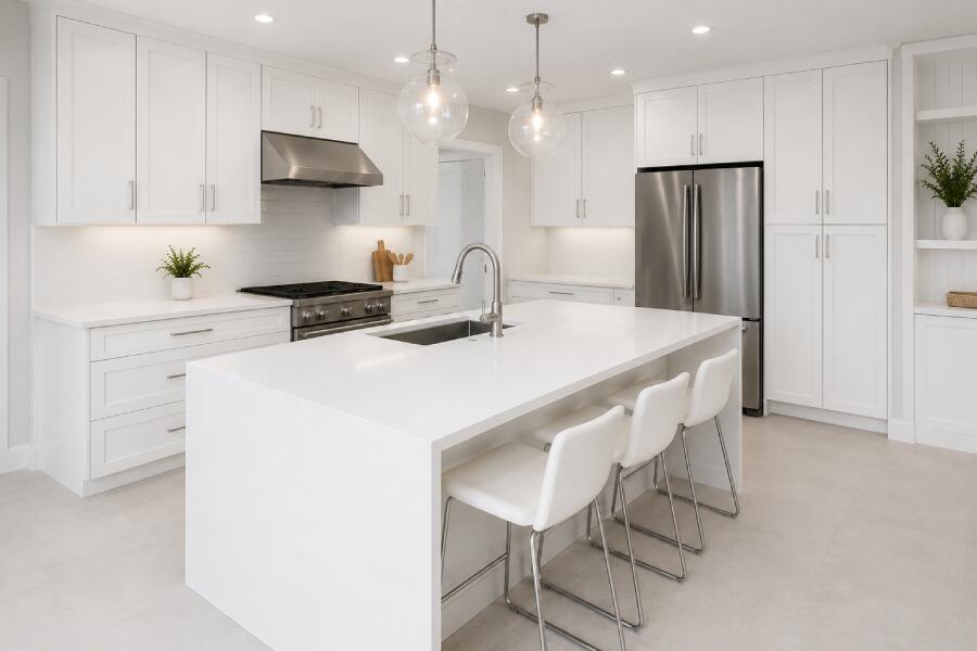
Extremely Bright White Quartz Can Sometimes Look Artificial
This is one of the most common design mistakes in modern kitchens.
Ultra-bright white quartz may sound luxurious at first, but in some kitchens it creates a flat, almost plastic appearance.
This usually happens when the surface has:
- No veining
- No texture
- No movement
- Excessive shine
- Cold undertones
Instead of looking natural, the worktop can feel overly manufactured under certain lighting conditions.
This is one reason marble-inspired quartz continues to dominate modern kitchen trends. Softer veining creates depth and realism that feels much more premium.
If you recently noticed this issue, you may also enjoy reading Why White Quartz Worktops Sometimes Look Grey, because lighting and undertones often affect how “luxurious” quartz appears.
Poor Lighting Makes Quartz Look Flat
Lighting completely changes the appearance of quartz surfaces.
Even expensive quartz can look dull under harsh or poorly positioned lighting.
Cool LED bulbs especially tend to create:
- Grey shadows
- Flat reflections
- Artificial shine
- Cold surface tones
Meanwhile, warm layered lighting usually helps quartz feel:
- Softer
- Richer
- More natural
- More high-end
Under-cabinet lighting makes a huge difference as well. It helps reveal veining, texture, and depth across the worktop surface.
This is why many premium kitchen showrooms invest heavily in warm ambient lighting rather than relying only on ceiling spotlights.
Thin Worktops Often Feel Less Premium
Thickness changes the entire visual weight of a kitchen worktop.
Very thin quartz surfaces sometimes create a cheaper appearance, especially in larger kitchens.
Many homeowners still prefer thicker styles because they feel:
- More solid
- More expensive
- More luxurious
- Better balanced visually
This is one reason articles like 20mm Quartz Worktops and Reasons to Select 30 mm Worktops have become increasingly popular during kitchen planning.
The right thickness often depends on:
- Cabinet style
- Kitchen size
- Island design
- Modern vs traditional look
- Edge profile
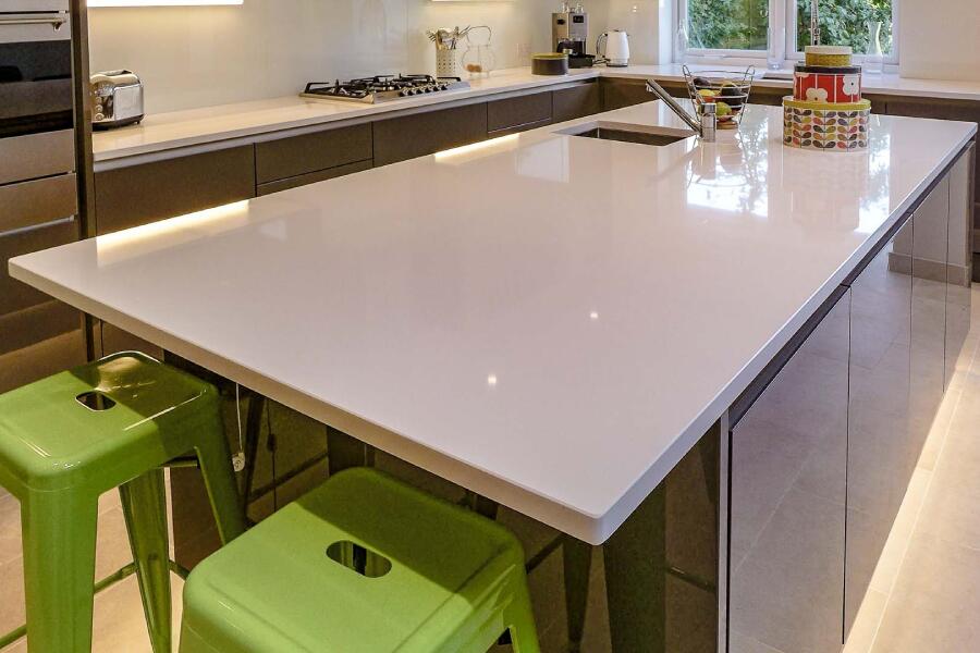
Cheap-Looking Quartz Usually Has Busy Patterns
This surprises a lot of homeowners.
People often assume dramatic veining automatically looks luxurious. But overly busy patterns can quickly overwhelm a kitchen.
Some lower-end quartz designs contain:
- Repetitive fake veining
- Overly bold movement
- Artificial sparkle
- High-contrast patterns
- Unrealistic marble effects
The result can feel visually chaotic instead of elegant.
In most modern kitchens, softer, low-contrast veining tends to age much better.
That is why subtle Calacatta-inspired surfaces remain one of the safest premium-looking options.
If you like softer marble styles, articles like Reasons to Buy Calacatta Gold Quartz explain why these designs continue to dominate luxury kitchen projects.
Bad Cabinet Pairings Can Ruin Expensive Quartz
Sometimes the quartz itself is beautiful.
The problem comes from the surrounding materials.
Even high-end quartz can look cheaper when paired with:
- Mismatched cabinet colours
- Poor flooring choices
- Busy splashbacks
- Cheap handles
- Low-quality lighting
- Too many contrasting tones
Modern kitchens usually work best when colours feel cohesive rather than competing for attention.
For example:
| Quartz Style | Best Cabinet Match |
| Warm white quartz | Oak, cashmere, beige |
| Marble-effect quartz | Soft grey, taupe |
| Dark quartz | Matte white, walnut |
| Cream quartz | Sage green, warm wood |
A customer recently upgraded from laminate to quartz, expecting the kitchen to instantly feel more luxurious. However, the old bright-blue splashback and cool LED lights made the new quartz feel strangely artificial. Once the splashback was replaced with a softer neutral design, the entire kitchen suddenly looked far more premium without changing the worktop again.
Overly Glossy Quartz Can Feel Cheap in Some Kitchens
High shine is not always better.
Some extremely glossy quartz surfaces reflect too much artificial light, especially in small kitchens.
This can create a showroom-like glare that feels less natural in real homes.
Many luxury kitchens now prefer:
- Soft polished finishes
- Honed quartz
- Satin textures
- Subtle movement
- Warm undertones
The goal is usually understated elegance rather than maximum shine.
Cheap Installation Can Ruin Premium Quartz
This part gets overlooked constantly.
Even expensive quartz can look poor after a bad installation.
Visible joins, uneven edges, poor silicone work, or awkward cut-outs immediately reduce the premium feel of the kitchen.
Common installation problems include:
- Thick visible joins
- Uneven waterfall edges
- Misaligned veining
- Poor sink cut-outs
- Bad polishing around corners
This is one reason homeowners researching surfaces often compare installation quality alongside material quality itself.
Articles like Can You Fit DIY Kitchens Yourself? help homeowners understand why fitting quality matters so much.
Some Quartz Colours Simply Age Better Than Others
Trends move quickly in kitchen design.
Very bold quartz colours sometimes feel outdated much faster than softer neutrals.
Most timeless kitchens still rely on:
- Warm whites
- Soft marble effects
- Light grey veining
- Beige neutrals
- Natural stone-inspired patterns
This is also why many homeowners compare quartz styles carefully before choosing a final design.
Related guides worth exploring include:
Does Expensive Quartz Always Look Better?
Not necessarily.
Some affordable quartz designs look incredible when paired with the right kitchen styling.
Meanwhile, expensive quartz can still feel disappointing with poor lighting or clashing finishes.
Luxury kitchen design is usually about balance rather than price alone.
The best-looking kitchens normally combine:
- Good lighting
- Consistent colours
- Quality installation
- Simple styling
- Realistic veining
- Warm textures
Final Thoughts
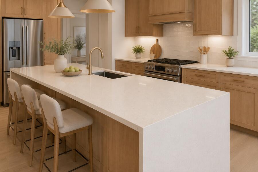
Quartz worktops themselves rarely look cheap.
Most of the time, the issue comes from design choices surrounding the surface rather than the quartz material alone.
Lighting, cabinet colours, thickness, finish, veining style, and installation quality all play a massive role in how premium the final kitchen feels.
The best kitchens usually avoid extremes. Instead of choosing the brightest, glossiest, or boldest quartz available, many homeowners now prefer softer, natural-looking surfaces with balanced textures and warm tones.
And if you are still comparing colours, finishes, or layouts, the team at get a quote can help you choose a quartz style that feels timeless, elegant, and properly matched to your kitchen design.
Frequently Asked Questions
- What colour quartz looks the most expensive?
Soft marble-inspired quartz with subtle veining usually creates the most luxurious appearance in modern kitchens. - Does white quartz look cheap?
Not always. However, extremely bright flat white quartz without texture can sometimes appear artificial under certain lighting. - Do thicker quartz worktops look better?
In many kitchens, thicker quartz surfaces feel more premium and visually balanced. - Can lighting affect quartz’s appearance?
Absolutely. Cool lighting can make quartz appear flat or grey, while warm lighting usually creates a richer and softer appearance. - What makes quartz look fake?
Overly repetitive veining, artificial sparkle, poor lighting, and low-quality installation are the biggest reasons quartz may look fake or cheap.